Oh, hey, while I'm in the middle of making posts that don't have anything to do with the actual story (I'm working on the next chapter right now, I promise), did you guys notice the new banner I put up?
Here's a comparison:
Old:
New:
I have to say, I really love the new banner. The old one was cool, don't get me wrong. It's a screencap of Metropolis from
Superman Returns, which fits really well. The bright almost-lens flare at the side is pretty cool, too. It's very reminiscent of an opening title card from a CW or MTV drama, which fits the whole theme.
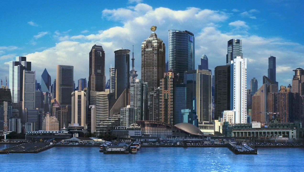
The new banner is a thousand times better, though. It's a screencap of Metropolis as it's depicted in
Smallville, which is basically the version of Metropolis that I'm using in this story.
The full screenshot, as seen above, is really pretty amazing with its waterline and its sheer verticality. It's also a bright blue, which is something that I couldn't get in the old banner no matter how hard I tried (altering the hue of the picture only made it speckled and cruddy-looking). It's really cool because it's literally like we can get a real look at the city I'm writing about; like you can grasp it. I can only hope that I'll get to write an ACTUAL superhero story one day that ends up on TV or film.



No comments:
Post a Comment